
Technical indicators are at the core of every successful trade, so taking the time to understand and utilize them is practically a necessity. While there’s no shortage of indicators and their various trend signals, Bollinger Bands are a particular favorite among traders and investors. This tool can help measure market volatility, as well as identify overbought or oversold market conditions.

What are Bollinger Bands?
Bollinger Bands are a technical analysis tool used to analyze a traded asset’s price and volatility to make informed buy or sell decisions. They consist of three lines or bands — one simple moving average (SMA) line and two standard deviations of the price (upper and lower) lines.
The upper and lower bands are plotted on either side of the SMA line while standard deviations determine the distance between them. These deviations represent the volatility range of the asset in its price movements.

You may also like:
What is the Bollinger Bands Squeeze?
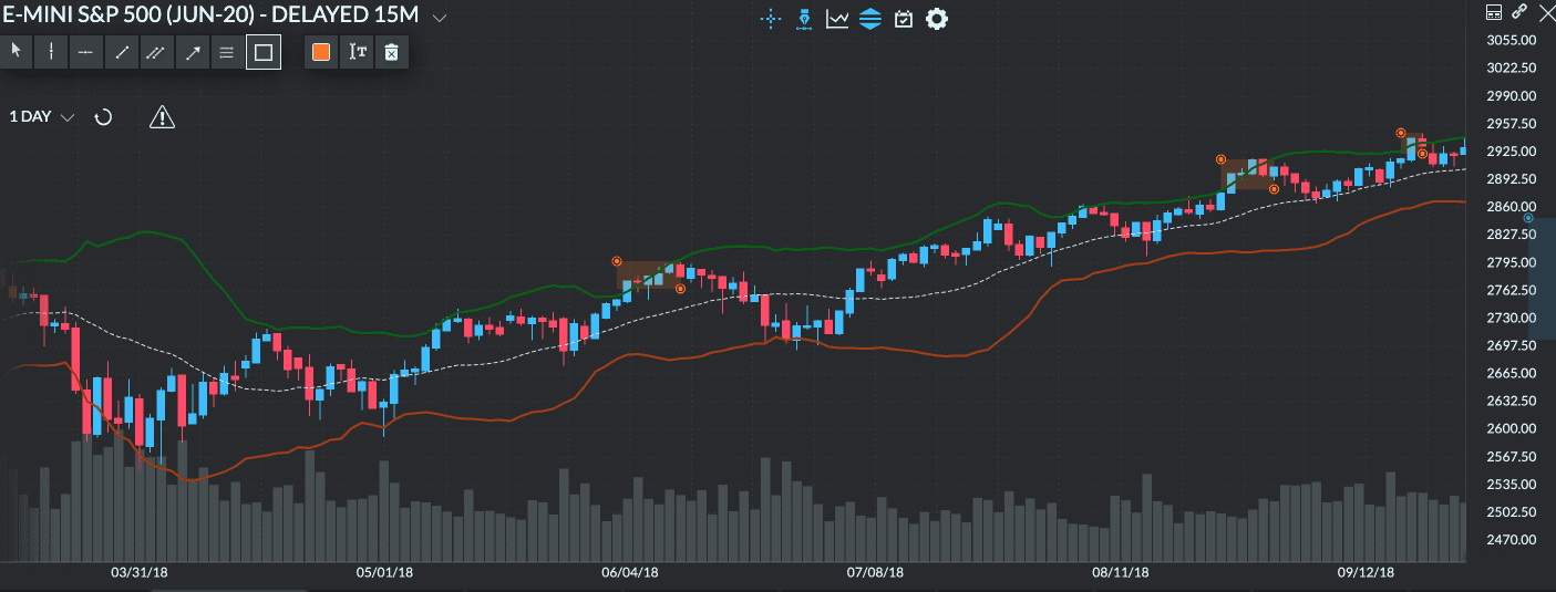
A squeeze refers to a very tight corridor formed by the contraction of the Bollinger Bands around the price. If, after the period, the price closes above the top band, it will likely continue moving upwards. Conversely, if the price closes below the bottom line, it will likely continue moving downward.
Bollinger Bands Bounces
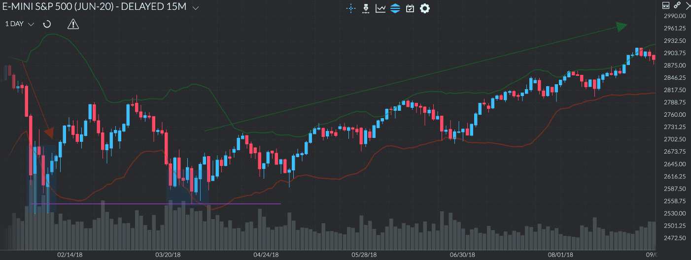
On the other hand, bounces are based on the premise that price tends to get drawn towards the average. Since the upper and lower bands essentially become our support and resistance levels, it’s not so hard to predict the next possible price move. This concept is the basis for the “overbought” and “oversold” strategies.
In other words, if the price goes up and nears the top band but doesn’t cross it, there’s a good chance it will bounce down, which signals a sell action. If it reached the lower band without crossing it, then odds are it will bounce up, signaling a buy action.
Bollinger Bands Squeeze Strategy
The Bollinger Bands squeeze is quite popular. It’s a trading strategy that relies on accurately spotting potential price breakouts. Market volatility typically contracts during times of decreasing trading volume, especially just before a major price breakout.
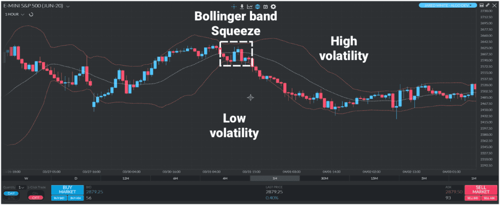
Hypothetically, if you were trading the above chart, then you’d simply identify the correct breakout point, take a long position, and ride out the resulting price rise. In reality, however, you’ll need to confirm the next price movement during a squeeze as the breakout can always go the other way.
How to use Bollinger Bands
Like all technical indicators, Bollinger Bands do not give definitive buy and sell signals. They can, however, help predict future price action to help you pick your ideal entry and exit points. As such, you shouldn’t use it as a standalone tool but rather one that complements other technical analysis tools.
With that out of the way, let’s look at how to read Bollinger Bands and utilize them for your trading.
As mentioned earlier, Bollinger Bands have 3 lines, including the SMA line and an upper and lower line. To read Bollinger Bands, you need to look at all three lines. The simplest way to read the three Bollinger lines is to think about whether the market is considered expensive or cheap.
When the asset price is in a downtrend
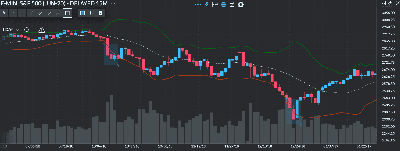
When an asset is in a downtrend, the SMA and the upper and lower lines of the Bollinger Bands follow. The 3 lines are lagging behind the price. As the price approaches and breaks the lower Bollinger Band, the underlying asset is considered “cheap.” That’s because, at the -x2 standard deviation, the price moves too far below the SMA. This may be a good opportunity to buy the asset (i.e., place long positions) and is generally not a good time to sell.
When the asset price is in an uptrend
The same thing happens when an asset price is in an uptrend; the Bollinger Bands lag behind. However, as the price approaches and breaks the upper Bollinger Band, the underlying asset becomes “expensive.” That’s because, at the x2 standard deviation, the price moves too far above the SMA. This may be a good opportunity to sell the asset (i.e., place short positions) and is generally not a good time to buy.
When The Asset Price Is Flat
During flat markets, the upper and lower Bollinger Bands tend to hover very close to the SMA. That’s because, in flat markets, volatility is very low. Because of this, reading the Bollinger Bands doesn’t provide too much trend analysis insight during sideways price action. Once volatility increases, the lines, and price start moving again, which can help with trend analysis again.
Bollinger Bands Strategies
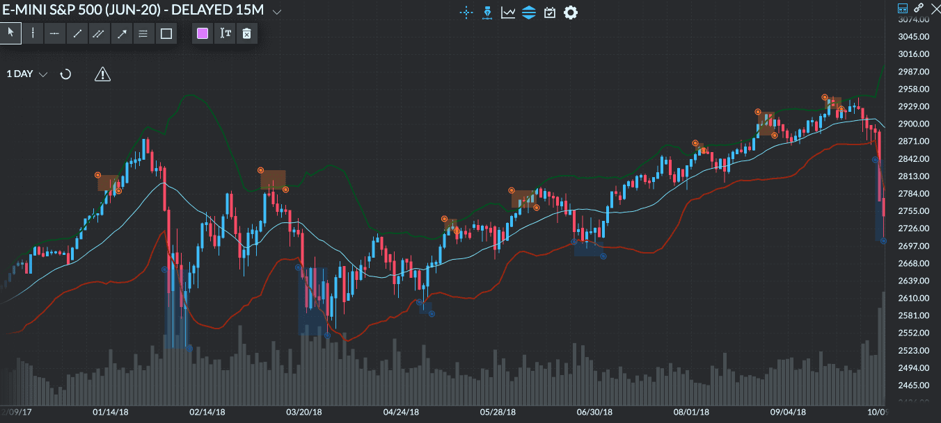
1. Double Bottoms
This strategy looks to identify signs of lower resistance level testing that usually happens before a sharp price rally. There are two bottoms to look for – the first should stop below the lower band and occur when there is high volume, while the second represents a resistance test on a lower volume.
The double bottom essentially signals that the market has established a new short-term support level, so prices are expected to mainly move up from there.
2. M-Tops
This strategy is the opposite of the Double Bottoms and is meant to identify trend reversals. In this instance, the price registers two high tops close to or sometimes even above the upper Bollinger Band. Then the price sharply pulls back to form an “M” pattern on the chart.
The idea here is pretty straightforward – the market has found a new key resistance level, so it might be a good time to short it. That’s because there is a high chance that the price will drop even lower.
3. Double Bollinger Bands
For the double Bollinger Bands strategy, two Bollinger Bands are required on a chart. The first set of bands is one standard deviation from the SMA. The second set of bands is two standard deviations from the SMA. With five lines on the chart, four trading zones are created:
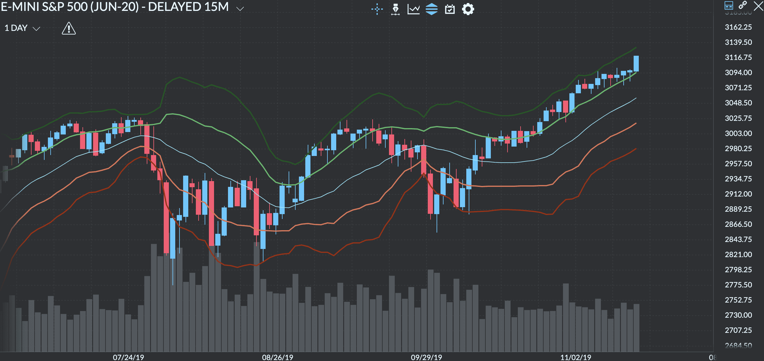
- The first one is the buy zone. That’s when the underlying asset price is between the 1 standard deviation upper band (light green line) and 2 standard deviations upper band (dark green line). When the price is in this zone, the uptrend is strong. Therefore, there’s a high probability that the price will continue in its bullish fashion. It’s called the buy zone because that’s the zone where keeping long positions and entering new long positions is more likely to bring favorable returns.
- The second and third ones are neutral zones. That’s when the underlying asset price is between the +1 and -1 standard deviation upper (light green line) and lower (orange line) bands. When the price is in this zone, there is no strong trend. There isn’t enough bullish or bearish momentum.
- The fourth one is the sell zone. That’s when the underlying asset price is between the -1 standard deviation lower band (orange line) and -2 standard deviation lower band (red line). It’s the exact opposite of the buy zone. When the price is in this zone, the downtrend is strong. Therefore, there’s a high probability that the price will continue in its bearish fashion. It’s called the sell zone because that’s the zone where selling your long positions, keeping short positions, and entering new short positions is more likely to bring favorable returns.
Limitation of Relying on this indicator alone
Based on this data alone, it may seem ideal to put in a buy order every time the price approaches the lower band or sell every time it approaches the upper band. However, just because the market is deemed cheap or expensive doesn’t automatically mean that you should enter or exit a trade right away.
This is because trending markets can sometimes ride the bands for a long time and suddenly stop existing trades using the cheap/expensive model. This could result in potentially huge losses. That’s why you should always use another indicator, such as the Relative Strength Index (RSI), to confirm the “squeeze” and “bounce” of both upper and lower bands.
How Bollinger Bands help with trend analysis
The Bollinger Bands indicator was invented by the renowned trader and financial analyst John Bollinger in the early 1980s. They essentially help you identify possible price reversals by determining overbought and oversold levels using standard deviation.
This indicator doesn’t require too much analysis to arrive at an informed decision — the upper and lower bands widen when the market is experiencing high volatility and contract during times of low market volatility.
With these signals, traders can better follow trends and time their entries more efficiently and trail their stop-loss. Bollinger Bands are popular because they envelop market price and base their calculations on price as well. This way, traders can utilize them to decide whether or not to enter the market at a particular time.
Why is it so important to measure market volatility
Well, for one, volatile markets offer more trading opportunities than those without much activity. More importantly, volatility can often predict the market’s direction and is a measure of its performance.
Back in 2011, Crestmont Research conducted a study of the historical relationship between volatility and market performance. For its analysis, Cresmont measured the volatility of the S&P 500 using the average range for each day. At the end of the study, they concluded that higher volatility signals a higher probability of a downward trending market. In comparison, lower volatility signals a higher probability of a rising market.
Relationship of Volatility and Market Returns
Monthly Data: S&P 500 Index Average Daily Range
| Volatility Rng | % Up Month | % Down Month | Avg Gain | Avg Loss | Exp Gain/Loss | |
| Q1 | 0-1.0% | 70% | 30% | 2.9% | -1.9% | 1.5% |
| Q2 | 1.0-1.4% | 61% | 39% | 3.0% | -2.1% | 1.0% |
| Q3 | 1.4-1.8% | 59% | 41% | 3.2% | -3.2% | 0.6% |
| Q4 | 1.8-2.6% | 41% | 59% | 5.2% | -5.0% | -0.8% |
Annual Data (1962-2011): S&P 500 Index Average Daily Range
| Volatility Rng | % Up Month | % Down Month | Avg Gain | Avg Loss | Exp Gain/Loss | |
| Q1 | 0-1.1% | 91% | 8% | 15.8% | -1.5% | 14.5% |
| Q2 | 1.0-1.5% | 75% | 25% | 15.7% | -6.0% | 10.3% |
| Q3 | 1.5-1.8% | 83% | 17% | 14.2% | -11.6% | 9.9% |
| Q4 | 1.8-2.7% | 38% | 62% | 17.7% | -19.4% | -5.1% |
As you can see in the table above, a low average daily volatility range in the S&P 500 (in the first quartile) results in higher chances of investors making 1.5% monthly and 14.5% annually.
On the other hand, in the fourth quartile, the chances of turning a profit on investment are lower and even record potential losses of -0.8% for the month and a -5.1% for the year.
Limitations of Volatility
Keep in mind that while volatility can be a useful tool, it also presents significant investment risk since it increases both your chances of posting gains and turning a steep loss. That’s where Bollinger Bands come in. By carefully analyzing all three bands and the rate of contraction or widening between them, you have a better chance of predicting ideal market entry and exit points.
Setting Up Bollinger Bands in your trading platform
To use Bollinger Bands, you’ll obviously need an online trading platform or trading analysis tool. There are many available online. For example, Finamark or your own trading or brokerage platform. Here’s also a list of the top online brokers in the world.
For our purposes, we’ll use Finamark, and I’ll walk you through the steps to set your Bollinger Bands.
1. Open your trading platform and login if required.
2. Search for a symbol you’d like to analyze. We’re using the default one on Finamark.
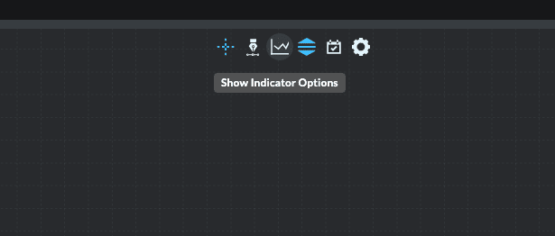
3. Click on “Show Indicator Options” or something similar on your trading platform.
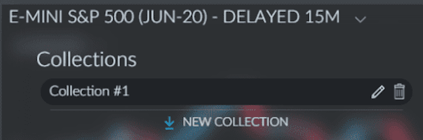
4. Click on “NEW COLLECTION” and type in “Bollinger Bands” in the search if there is one or look for it in the list of indicators.
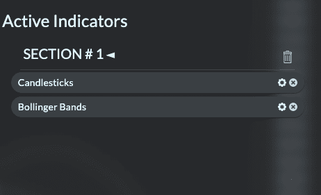
5. Click on “Settings” or an icon that looks like a gear beside Bollinger Bands in the Active Indicators SECTION # 1.
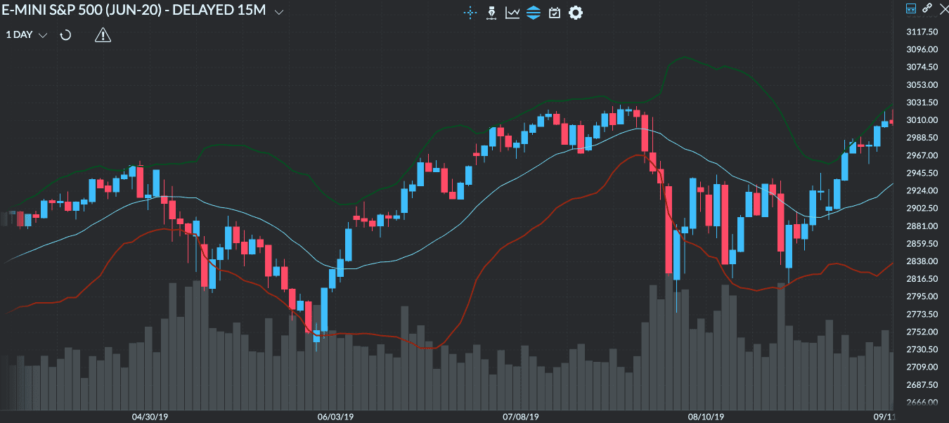
6. Setting it up on the chart, the default settings for the Bollinger Bands would look something like this:
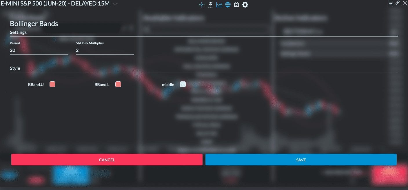
7. Edit any number of things as you see fit, such as Period, Standard Deviation Multiplier or Style and Colors.
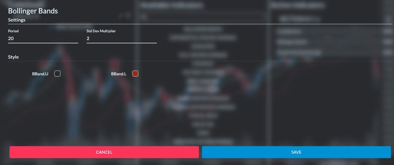
For example, I changed the color of the upper band to green and the lower band to red. I also made them solid and slightly thicker than the default. Once you set your preferred setting, click Save.
Indicator settings
The setting defaults to a 20-day period for the SMA and sets the upper and lower lines to (x2) standard deviations away. This way, these bands can capture at least 85% of the price data moving between them for that period.
The standard Bollinger Bands formula uses a 20-day SMA for the middle line, while the other two are calculated based on volatility compared to the SMA. You can always modify this setting according to your trading preferences. For instance, some traders prefer to calculate the SMA based on a 10-day period only since they do not consider the data before being as relevant as the data from a more recent period.
That being said, if you are new to the concept of Bollinger Bands, it’s best to just stick with the default setting until you’ve mastered their interpretation before making any variations.
The Bottom Line
The Bollinger Bands indicator can help you find excellent market entry and exit points. However, as with any technical analysis tool, make sure to first practice using Bollinger Bands and perfecting your predictions before hitting the live market.
Remember also that this indicator should not be the only item in your trading arsenal; after practicing with Bollinger Bands for a while, learn how to use another tool, such as the Ichimoku Cloud, or at the very least, stay up to date on the various chart patterns.