
When it comes to technical analysis, there is a temptation to ignore the basics. Many traders fall into the trap of looking for strategies that are, well, more complicated. The concept of support and resistance levels is straightforward to understand in theory. In practice, however, it is a little more difficult. The common misconception is that it is just “drawing support and resistance lines” on a chart. There is some truth to that. Proper use of support and resistance doesn’t have to be complicated. The key is finding the right level for your lines and using them wisely.

What is Support and Resistance?
The whole idea of support and resistance in technical analysis is identifying areas where there is support and resistance.
Support
Support price levels identify an area where there has been demand from investors. This can often result in a downward trend pausing for a moment and then taking one of the following paths:
- Continuing the downward trend through the support line. That’s a sell signal.
- Bouncing off the support line and moving into an upward trend. That’s a buy signal.
- A prolonged period of consolidation. This indicates that there is no trend.
Resistance
When it comes to resistance price levels, this is an area where investors have historically looked to take profits or go short instead of taking out new long positions. The potential paths when hitting resistance lines are as follows:
- Continued support pushes the price above the resistance level into new territory. This is a buy signal.
- Profit-taking will see the price fall back, switching into a downtrend. This is a sell signal.
- A prolonged period of consolidation. This indicates that there is no trend.
When a price breaks through a resistance level, this can switch and become a support level. Similarly, with a downward trend support level, if the price crashes through this level, it can prove to be a resistance in the event of a recovery. You would be astounded at the number of times support, and resistance levels emerge on price charts. They often end up flip-flopping from support to resistance and vice versa.

You might also enjoy:
- How to Open a Brokerage Account & How to Choose the Right Broker
- Futures Spread Trading – Guide on How to Trade Spreads in Futures
How to Find Support and Resistance Zones
Once you know what you are looking for, you will begin to see how support and resistance lines form many different trends. Because the E-Mini S&P 500 is the most heavily traded futures contract globally, we thought it would be interesting to look at its price going back to 2018.

The first trend line is at 3018.75, the second line at 2824.75, and the third at 2625. At first glance, they look like random lines on a chart. However, once you review the lines, you will start to see various patterns emerging.
There are a few principles to follow when looking for them. These include:
- Limit the number of trendlines; otherwise, your chart gets too cluttered
- Draw lines in a may maximize the number of times that price touches them (for both peaks and troughs)
- You may need to adjust your line slightly to secure the most touches
We will now look at the individual support and resistance lines and then how they work together.
Green line
Looking from left to right, you will see that the green line is initially a support line with two distinct rebounds from this level. However, the third touch on the green line prompts a period of consolidation (indicating a lack of interest from buyers). We then see sellers getting the upper hand as the index crashes through the 2625 level. When the index begins to recover, there is a short period of consolidation just above the green line as buyers continue to take the upper hand.
Blue line
What makes the blue line interesting is that working from left to right, there are numerous occasions when it acts as resistance and later as support. We can see three bouts of resistance in the early days just under the blue line. These are commonly referred to as “power moves,” which can further reiterate support and resistance levels.
Later there is a period of consolidation under the blue trendline, acting as resistance, but slowly buyers gain the upper hand, and the chart moves into higher ground. Towards the right-hand side of the chart, there are numerous occasions where the blue resistance line has flipped to become a support line.
Orange line
We could have drawn in another trendline around the 2965.75 level, highlighting an area of resistance before testing the 3018.75 level. You can see that the chart tests this level on more than three occasions before eventually pushing through and moving ahead into new territory. In hindsight, the signs that the market was looking to edge higher were all there. We saw several higher lows, trading between different resistance/support bands. Eventually, the momentum pushed the price through 3018.75 into uncharted territory.
Trading bands
As you can see clearly from the chart, there are numerous changing trends between the green and the blue line. Indeed, when the price crashed below the green support line, this resulted in a significant sell-off. There are also times when the blue line acted as support, with the orange line offering resistance.
Why Are Support and Resistance Zones Important?
Support and resistance zones are critical because they indicate short, medium, and long-term trading ranges. As you can see from the chart above, there are distinct trading ranges between the green and blue trend lines and between the blue and the orange lines. You can see both periods of support and periods of resistance, which, when ultimately broken, can result in a significant change in trend.
Many people are surprised at the historic nature of trendlines, which can go back many months and sometimes years. It seems that while investors might forget the historical highs and lows of a particular asset, markets don’t. Momentum is also an important key to any form of technical analysis; spotting emerging momentum and trying to predict how asset prices will react is a skill in itself.
You will notice in the vast majority of support/resistance zone breakouts, there is a period when momentum is building. Bounces from the support level become weaker, the rebounds from the resistance level are shortened, and slowly but surely momentum builds. On the downside, sellers are slowly taking control of the market while breaking through resistance; selling pressure is being taken out by buyers pushing prices higher.
Retests and Breakthroughs
With many technical charts, wild fluctuations are less powerful when testing and breaking through resistance/support levels. Like an elastic band, if a move goes too far too soon, then at some point, it will snap back. So-called “power moves” can create extremely lucrative trading scenarios with an asset price bouncing between support/resistance levels. The problem for traders is predicting when these tests of support/resistance will result in a breakthrough. Let’s look at a scenario that shows how momentum is the key to breaking support/resistance.
Let’s assume you are renovating your property and need to knock down a well-built and solid wall. If you took one long run-up, resulting in a big hit, the effect would be minimal; you would probably hurt yourself. The momentum would not be enough to cause any damage, and you would likely end up bouncing off the wall. What if you tried a different approach? Let’s say you began chipping away at the wall bit by bit, weakening the brickwork (or resistance), much like an asset price constantly bouncing off support/resistance levels. This would build up pressure, build up momentum, weaken the resistance, and slowly but surely break down the wall.
Support and Resistance Indicators
When looking at trendlines, we can also use channels that show changing support/resistance levels. As you can see from the chart below, the lower line offers a degree of support for the uptrend. The higher line initially offers a degree of support on the upside. However, once the chart slips below this line, it then becomes a line of resistance. Slowly but surely, momentum starts to fade until the asset’s price crashes through the lower support line. The buildup and reduction of momentum are the keys to unlocking support and resistance indicators.

We have a very similar situation concerning the chart below. The uptrend remains intact while the asset price is trading between the support and resistance levels. Once momentum begins to weaken, sellers gain the upper hand, and the price falls below the support level. This prompts a short but sharp price shock. It is easy to analyze these charts in hindsight, but it is also possible to identify support and resistance lines at a relatively early stage.

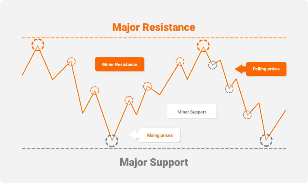
Major and Minor Support & Resistance Levels
So far, we have focused on major support and resistance levels, which offer a degree of long-term assistance with trades. You also find numerous minor support and resistance levels, which can often emerge into trends but are more difficult to read in the early stages. You can see numerous instances of minor resistance and minor support on the chart below. You tend to find that the short-term bounce from minor support, in a downtrend, grows as the asset price falls. This indicates that buyers are becoming more interested at lower levels as the price moves towards major support.
Meanwhile, during an upward recovery trend, the levels of resistance become easier to distinguish. Even more so as the price approaches the major resistance level. Only rarely will you see price move upwards or downwards in a straight line. On the way up, profit-takers will exit their positions from time to time. On the way down, those looking for value will often emerge, creating a short-term bounce. In a downtrend, what were previously minor support levels will often become levels of minor resistance when the recovery process begins. Support and resistance levels really are the ultimate double-edged sword.
How to Draw Support and Resistance Lines
The key to drawing support and resistance lines is to identify multiple areas of support/resistance. This means drawing it where the price would touch it most often. This can lead to numerous adjustments. For example, if you look at the chart below, we have the orange trendline. This line incorporates the highs of the three peaks in the center. However, if we move the trendline down just a little, we can incorporate at least two peaks to the left and resistance and support areas to the right. This is not an exact science, but when we drop the trendline down to 2796 from 2817.25, it highlights more resistance and support and gives a stronger signal.

The beauty of this type of technical analysis is that it is always open to a degree of interpretation. When it comes to the two resistance lines in the above example, there is a difference of approximately 20 points. In terms of futures contract trading, this could have a significant impact on your returns. If you were long on the S&P 500 and went for the more cautious 2796 trendline, you could potentially miss out on an additional 20 points.
On the other hand, when the index next breaks through the blue trendline around March 2019, you would be looking to go long and benefit 20 points early. If you can read the support and resistance lines, spot trading patterns, and changing trends, you will make money. In reality, you are highly unlikely to buy at the bottom of the market and sell at the top.
What Are Trendlines?
There is a very popular saying in the world of investment:
The trend is your friend”
The idea behind trendlines is simple; past performance is used to try and predict the future direction of an asset’s price. The following chart shows a distinct line of resistance together with a line of support that is merging. Once the index falls through the support line, there is a significant downtrend as sellers gain the upper hand.

Below you can see the same chart over a slightly longer period of time. It perfectly illustrates the trading range of the index between October 2018 and December 2018. You can see sharp and relatively short power moves on the way up and down. The result is a strong bounce off of the support and resistance levels. This chart also illustrates the power of the breakout both on the upside and the downside.

The next chart shows the benefit of long-term trendlines. While there was a short steep decline in the middle of the chart, the long-term uptrend still remained intact. It was only around October 2018 that the index fell below the long-term uptrend line. This eventually resulted in a significant fall. It is important to look at long-term trendlines and spot the support and resistance levels.

Ranging vs Trending Markets
Many people automatically assume that trending markets, where there are powerful positive or negative trends, are the markets in which you make the most money.
Ranging Markets
Ranging markets are when an asset price is trading between a narrow range of support and resistance. Here is an example of a ranging market:
While there are different definitions, some traders classify ranging markets as when an asset price bounces off the support and resistance three times in a relatively short time. There is no trend in place. It is difficult to know how or when this will change. However, in the short term, there was a relatively tight trading range. One which could be traded?
In theory, assuming that you set your stop-loss limits just below the support line for long positions and just above the resistance line for short positions, you can make good money in one of these trading ranges. They are effectively a consolidation phase, where the balance between buyers and sellers switches quite sharply. In this particular instance, sellers eventually got the upper hand, after which support disappeared.
Trending Markets
One of the charts from earlier perfectly illustrates the trending market phase:
Even though the index has been fairly volatile until October 2018, the uptrend beginning in November 2016 was still in place. There were numerous opportunities to take profits and buy back in at lower levels, especially around January 2018.
This shows the beauty of a long-term upward trend. It also illustrates that there will be opportunities to buy back in, even if you missed the initial burst. Even though the index dipped under the long-term uptrend line around January 2018, this was relatively short-lived. The trend broke just over 2800 in October 2018. The result was two attempted rallies falling by the wayside as sellers began to take control. This led to an eventual fall to circa 2300.
Using Support and Resistance Lines To Trade
There are several factors to consider when it comes to trading and support and resistance levels. If there is one thing you will notice early on, it is the fact that this is not an exact science. Even though powerful support and resistance lines are going back many months, if not years, the key to finding the right balance has as many touchpoints as possible on the chart. If you have just one or two support/resistance levels on a line, it isn’t firm. However, if you can broadly link six, seven, or eight support/resistance levels on one line, then that support level becomes much stronger in the minds of traders.
Example of using support and resistance
You will notice we have used this particular period of the S&P 500 again as it illustrates so many different trends, support levels, and opportunities to trade futures:

This is what is known as a ranging market. You can see how the support and resistance levels are hit three times. More importantly, it happens in a relatively short space of time. Initially, there was a relatively strong pattern of bouncing from support level to resistance and back again. In this particular phase, there were numerous opportunities to trade:
- Switch from a long position to a short position when the index hits the upper resistance level
- Switch from a short position to a long position when the index bounces off the lower support level
As far as using a stop-loss limit goes, when changing from a long position to a short position, this would be just above the resistance line. When changing from a short position to a long position, this would be just below the support line. At some point, the ranging market would begin to disintegrate as a new trend emerges. In this case, the final phase of the ranging market led to consolidation, after which there was a significant downturn. Traders switching from an initial short position to a long position when the index hit the support level would be prompted to switch again as the new downward trend gathered momentum.
Ranging market: 2630.25 to 2819.75
Trending market: 2630.25 to 2318.00
As the downtrend market was effectively in freefall after crashing through the support level, we would need to go back to May 2017 to see any kind of support. Coincidentally, this emerges at about 2318, which was the bottom of the down-trending phase. Fascinating stuff!
Final Thoughts
There’s no doubt that many traders will keep one eye on support and resistance levels. There are also other ways and means of supporting this kind of technical analysis. We could bring in additional indicators such as simple moving average, stochastic oscillator, and the relative strength index. These would likely assist in confirming any changing trends. The problem is that while averaging out historic data reduces volatility, the change in the long-term trend will take longer to come through. Therefore, if you use too many indicators, you may well miss a significant element of the new trend by the time they all line up.
The key to using support and resistance lines with your trading strategy is to keep things as simple as possible. Focus on stronger support and resistance lines and resist the urge to add more and more lines to your chart. Keep it simple, keep it focused and remember to adjust your trendlines to have as many touches on the chart as possible. Momentum is the key and the first signal of a shifting trend. If you can spot that consolidation period before a sharp spike upwards or drop downwards, you could find yourself some very lucrative trades.
F.A.Q.
Support and resistance levels are perhaps the most basic type of technical analysis. Quite why some people look towards more complicated forms of technical analysis is unclear. There is no need to reinvent the wheel.
Historic charts show defined support and resistance levels on many occasions. While skeptics may argue they are a “self-fulfilling prophecy,” they are actually a handy reminder of current/historical support and resistance levels. The key to high returns when trading futures is to spot the emergence of a new trend at the earliest opportunity. Many people would argue that support and resistance lines do just that. How you interpret them, well, that is a whole different discussion.
We have offered numerous examples of support and resistance lines and the volatile trading they can encourage. It appears that the stronger the uptrend towards a resistance line, the sharper the turn downwards. Conversely, the sharper a fall in an asset price, the sharper the bounceback if support is not breached. Numerous signs support lines are changing, such as:
– Falling highs and lower lows – indicating sellers are in control
– A period of consolidation around the support level
– An eventual breach of the support level often prompting a sharp fall
All technical analysis involves the balance of buyers and sellers to a certain extent. When each party takes control, they will dictate the trend over a varying degree of time. If you can spot that moment the trend is changing, that is where the money is made!